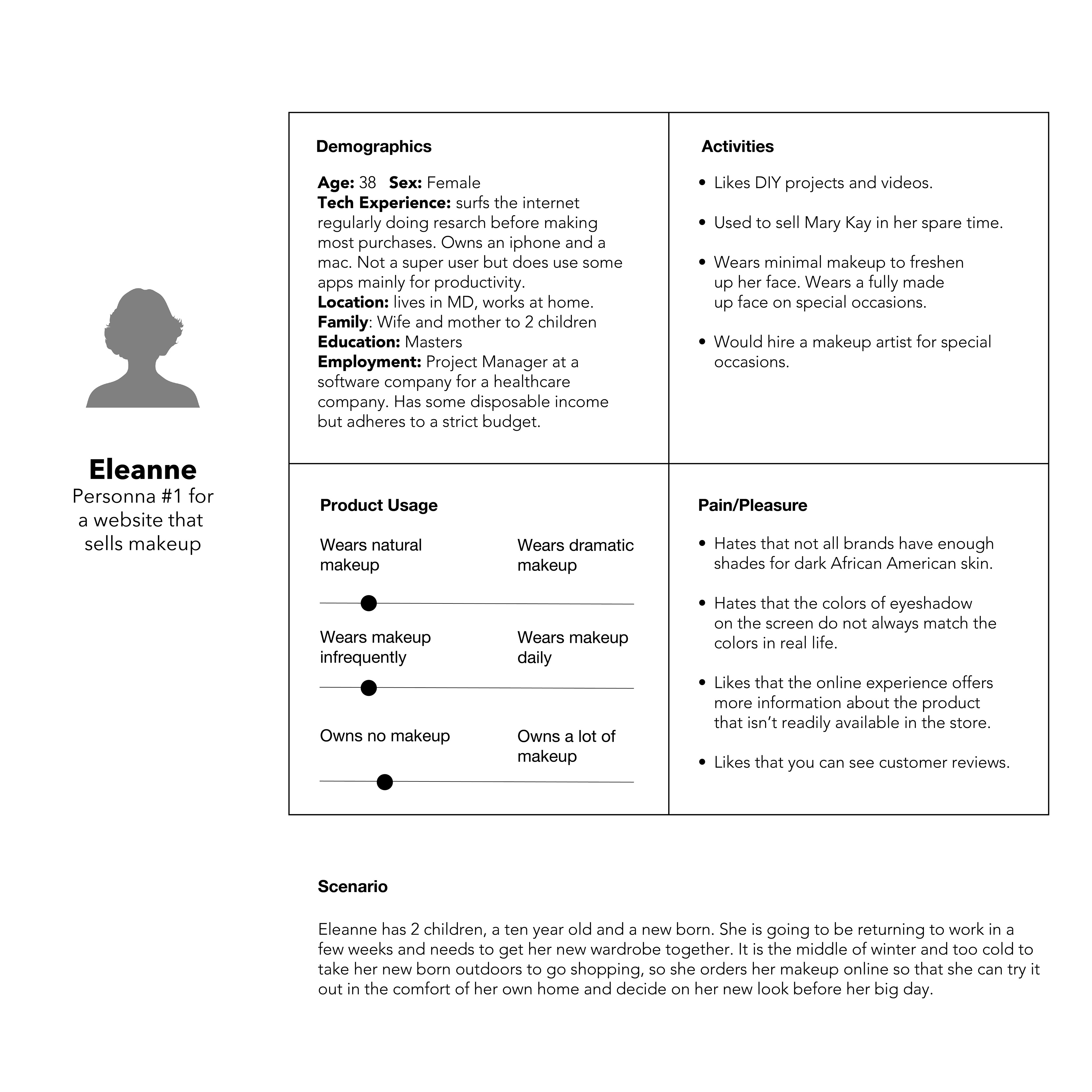
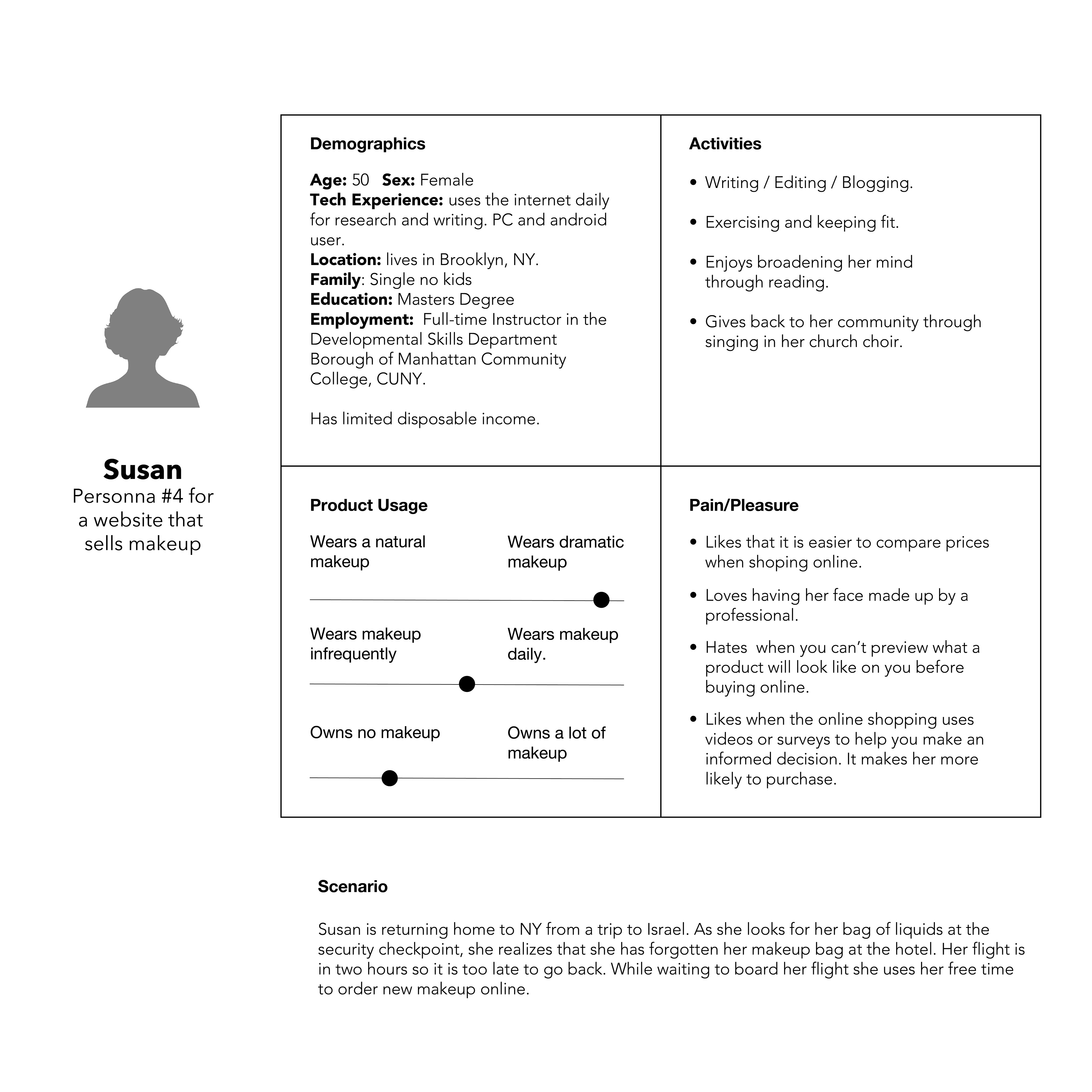
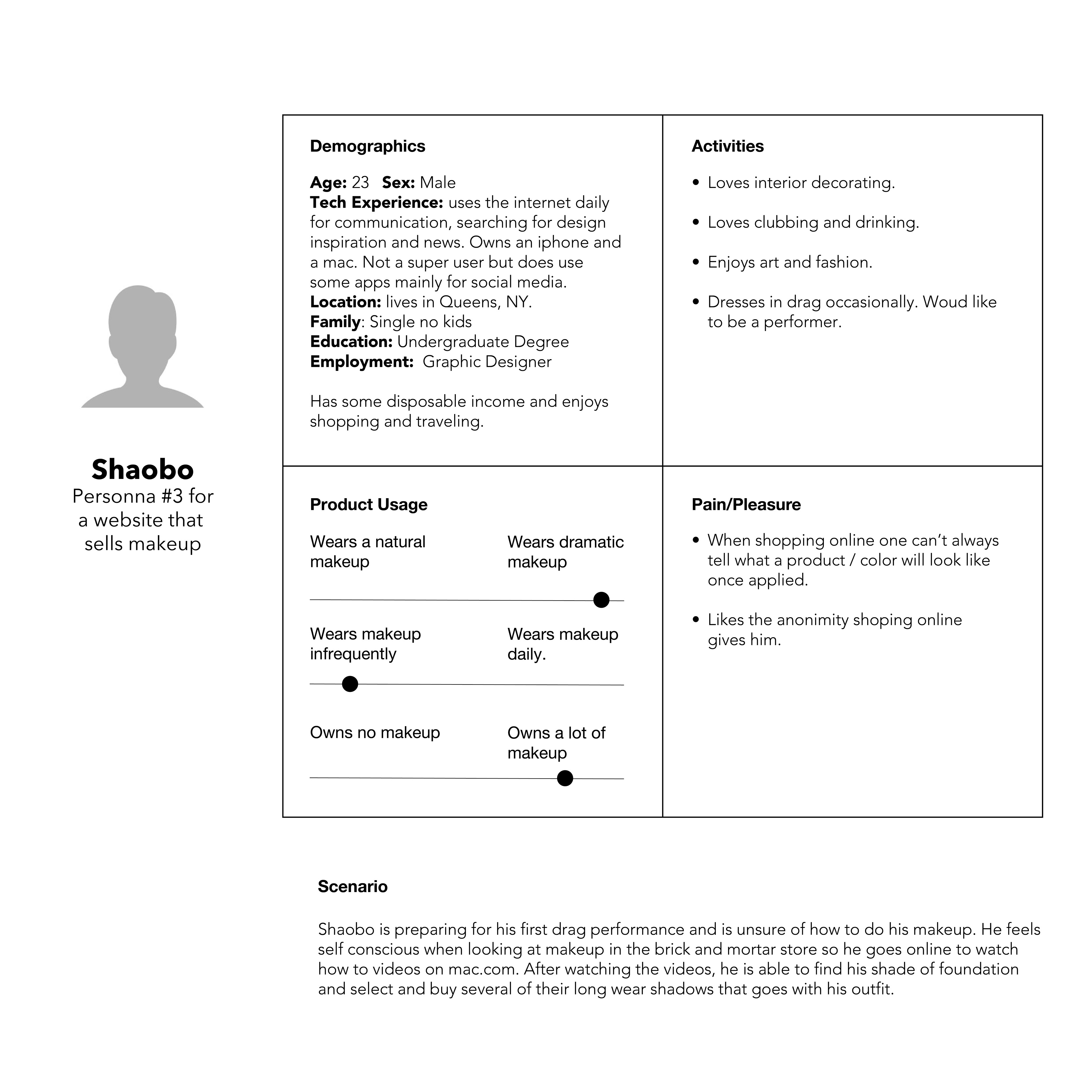
TARGET DEMOGRAPHIC:
MAC offers products at affordable prices for all ages, sexes, races and socioeconomic groups. Because of their price point and their standing in the LGBT community I have positioned their target demographic as working individuals both male and female between the ages of 18 and 50 with varied interests and some disposable income.
MAC offers products at affordable prices for all ages, sexes, races and socioeconomic groups. Because of their price point and their standing in the LGBT community I have positioned their target demographic as working individuals both male and female between the ages of 18 and 50 with varied interests and some disposable income.
INTERVIEW SUMMARY
One user found the site confusing / over whelming because there were too many choices. Would have preferred a survey that helped her through a process of elimination, to pick the best product for her skin.
One user found the site confusing / over whelming because there were too many choices. Would have preferred a survey that helped her through a process of elimination, to pick the best product for her skin.
The site is not geared to first time users who are not familiar with their products.
Too many clicks to get to the product details.
Not completely satisfied with the navigation of the site that has all of the product information buried.
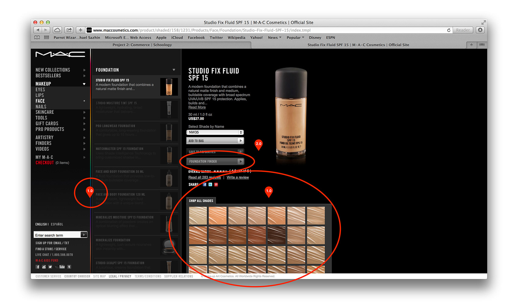
Liked the graphic bread crumbs afforded by the vertical design of the navigation.
Likes features like the foundation finder but thinks they are also buried in the site.
Would like it to be closely associated to the product.
Would like to see accompanied / associated products on the product detail page.
Shopping bag is in an unusual place therefore hard to find.
Needed the products to have a little more information to help inform the user’s purchase.
Users didn’t always find what they expected to find when clicking into a category.
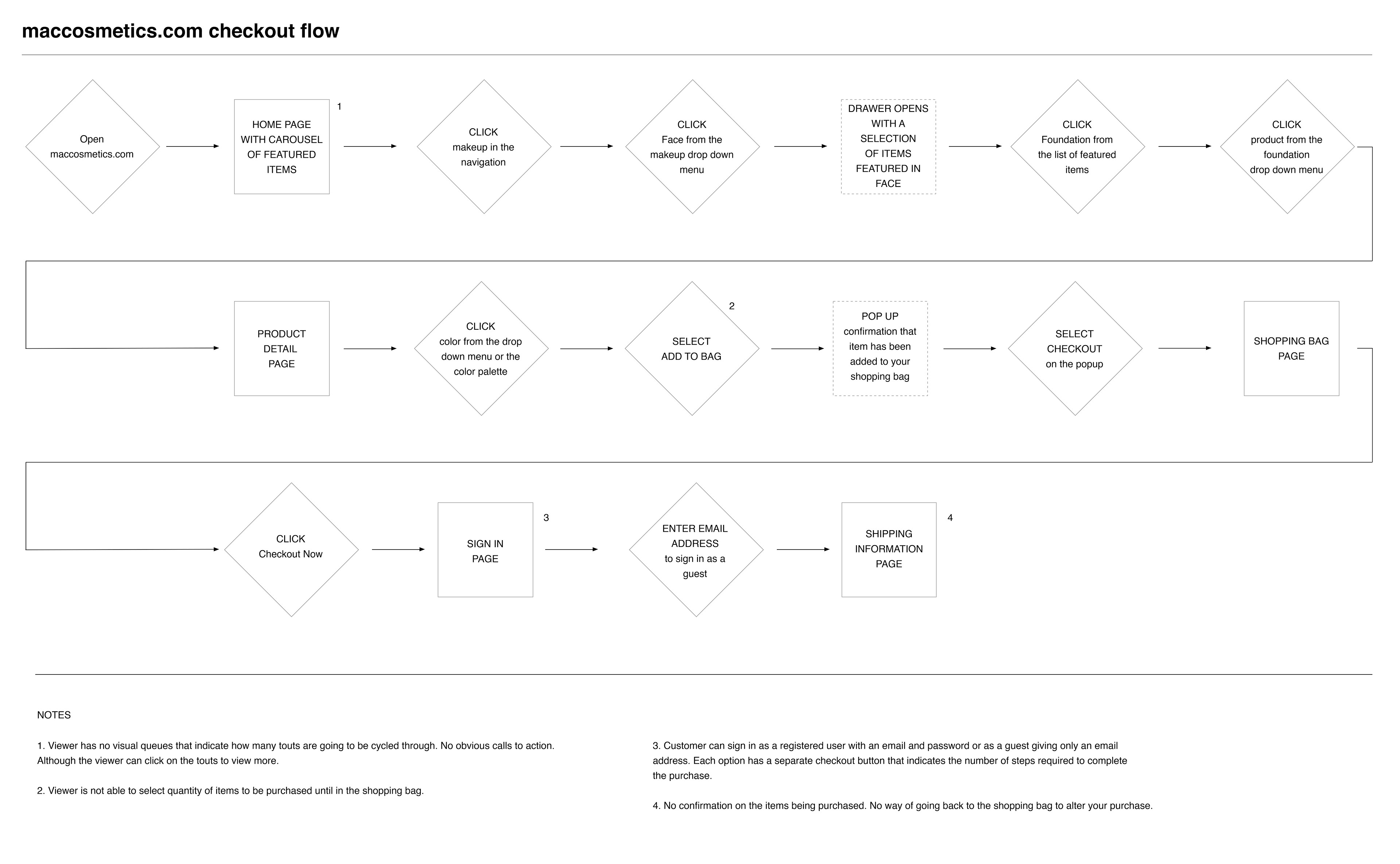
SHOPPING BAG / SHOPPING CART
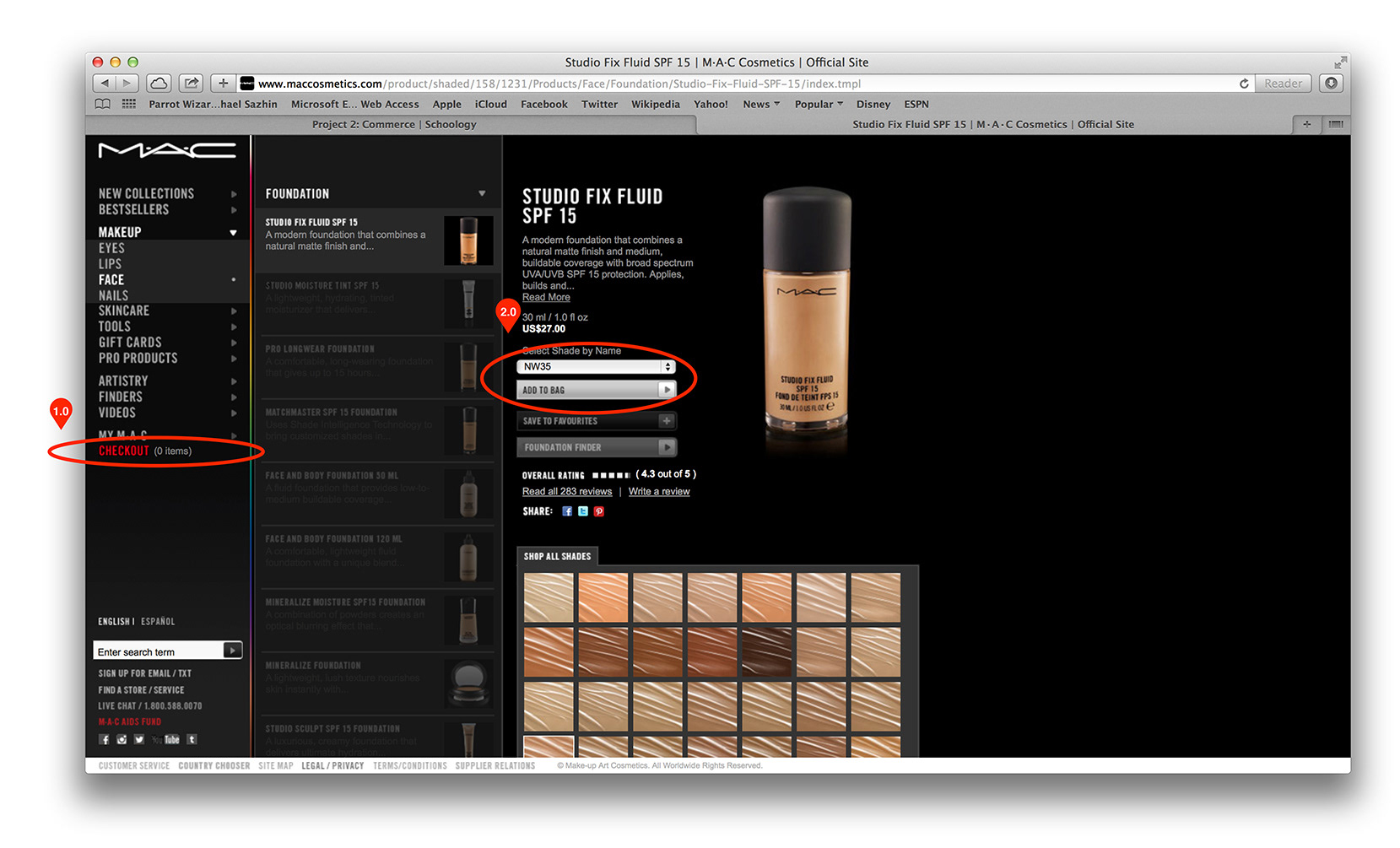
1. Checkout is not where users expect it to be. Both users had some difficulty finding the checkout link.
1.1 User must click the red checkout link or any checkout link to see what is in their cart.
1.2 User cannot empty the shopping cart in 1 click. Each item must be removed individually.
2.0 The site sets a default quantity of 1 item. User must go into into the shopping bag to alter quantities.
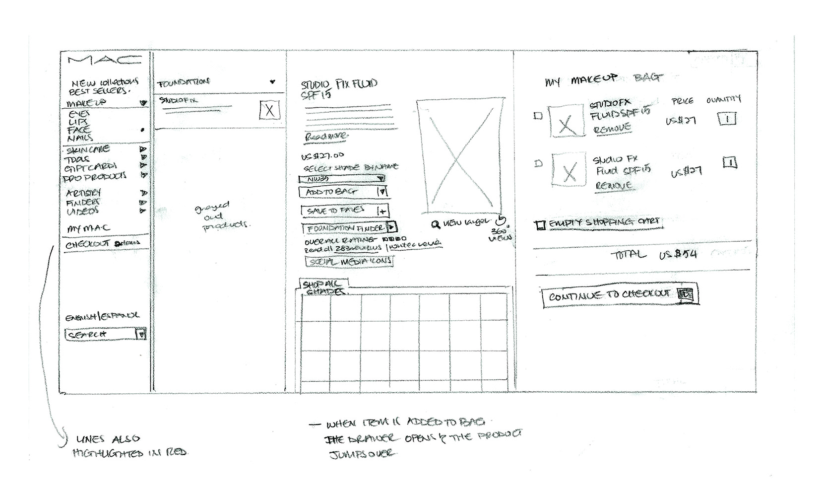
NEW SHOPPING BAG / SHOPPING CART SKETCH

NAVIGATION PAGE
1. Product detail information is 4 clicks in
1.1 Users did enjoy the visual breadcrumbs that the navigation provided. However they found product detail information to be buried. The need for 4 clicks can be alleviated by having the drop down menus display on hover instead of on click.
PRODUCT PAGE
1. Color play, a hidden color strip that allows the user to see what applications are available in each color. eg. area, product form, finish, coverage. Applies to color only.
1.1 Users found that it would be useful to have a tab that gives recommended products based on the selection.
Eg. the screen shot shows that the user has selected a foundation (base product), the recommended products will show him/her, different product forms and finishes available in that shade as well as complementary powders and blushes. If the user selects an eye color then recommended products will show complimentary lip and cheek colors in their available forms. This feature will provide the upsell and advice usually given by the makeup artist in store.
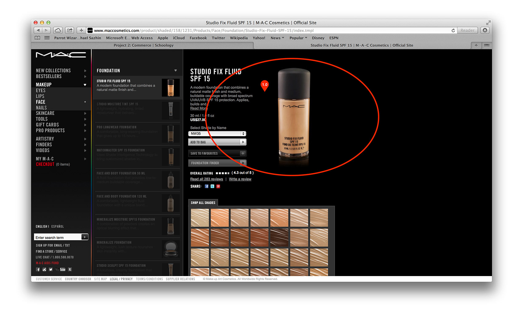
2. None of the user testers noticed the media associated with the product. Had to spend time searching for it.
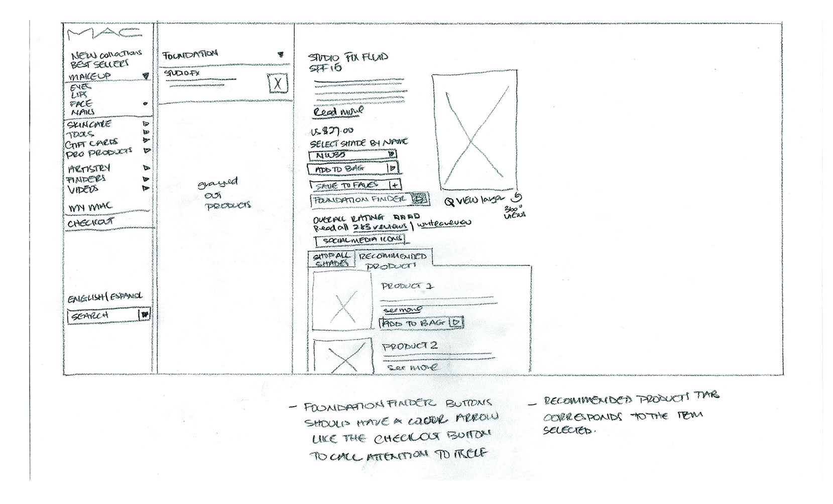
NEW PRODUCT PAGE SKETCH
PRODUCT DETAIL PAGE
1. Users wanted to see larger product views and the ingredients of the product.
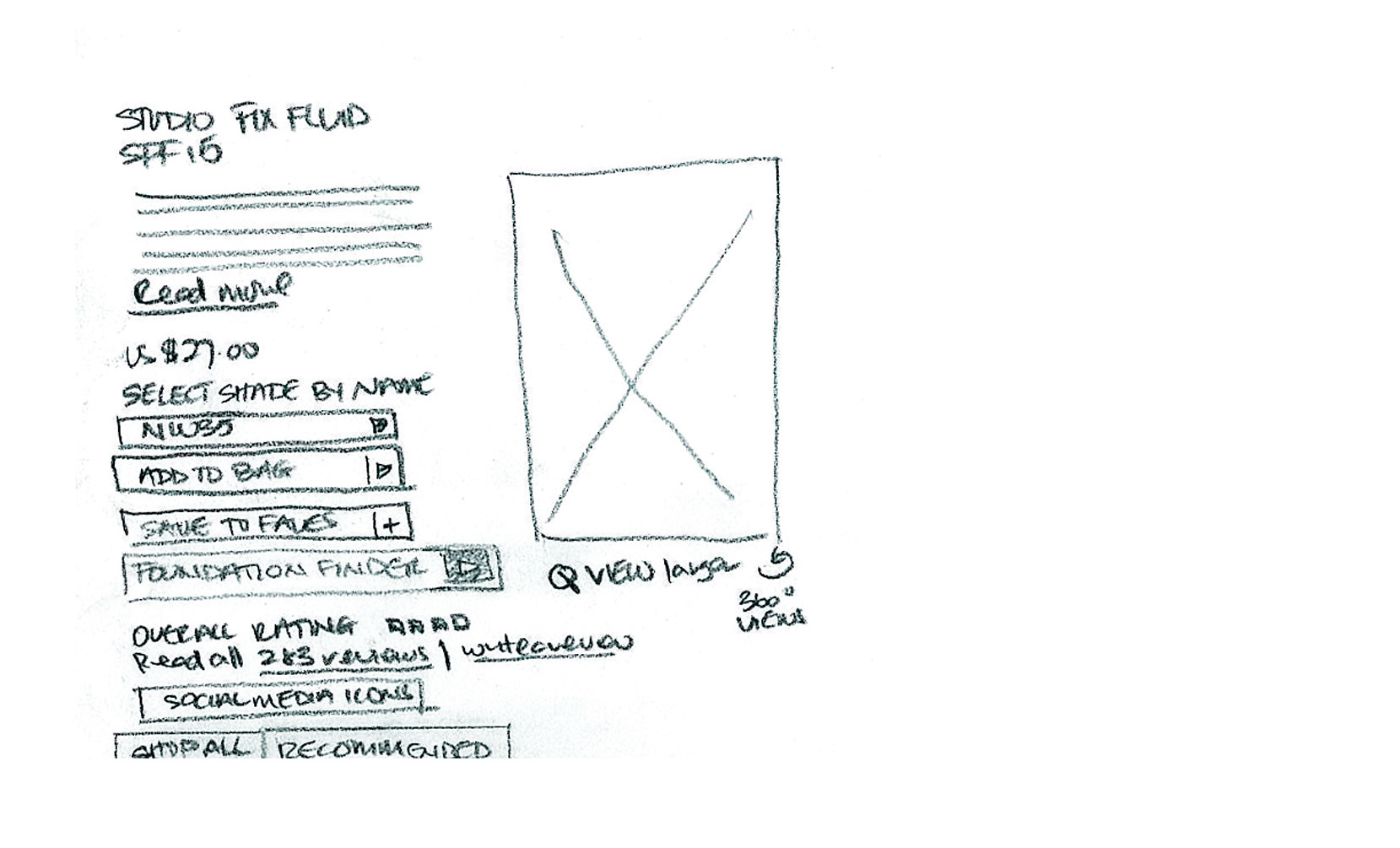
NEW PRODUCT DETAIL PAGE SKETCH

CHECKOUT
1. There is no opportunity in the shipping process to view or review or edit items in your shopping bag.
2. No link to take you directly back to the shopping cart.
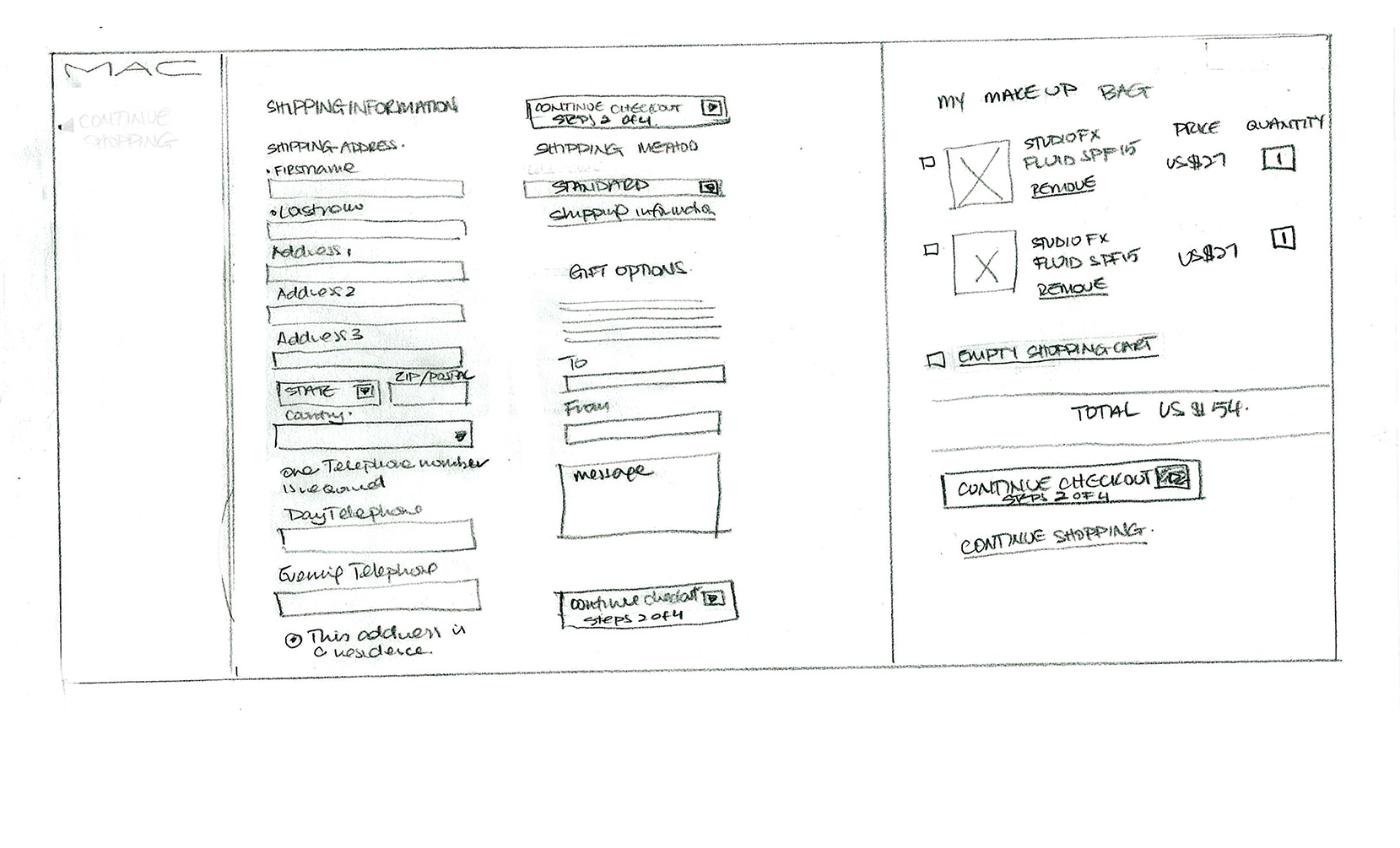
NEW CHECKOUT FLOW SKETCH